Wildcat History
Northwestern's Two
Gothic Typefaces
For
roughly the last 15 years, Northwestern has used a set of typefaces
with increasing consistency to represent both its athletics program and
the school in general. Some of these are relatively recent additions to
the school's aesthetic; others have roots going back over a century.
The
recent set of academic fonts include Campton, Periódico (NU uses
a variant of this for its main wordmark), Poppins, Noto Serif, and
Akkurat.
NU's
athletic typeface is Morgan Poster Avec, which took hold in the early
2010s and became more visible with the choice to add it to the new
Under Armour jerseys in 2012:
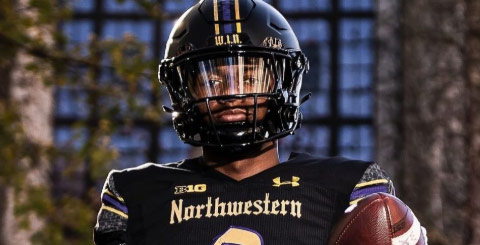
Two years later, when Northwestern introduced its Gothic uniforms, it put "Northwestern" on the chest in a Gothic font:
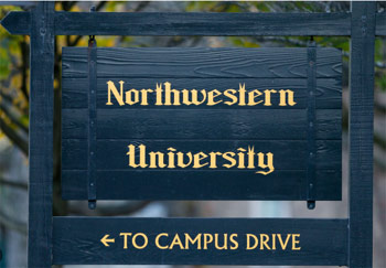
This font is famously used on NU's old black and gold signs outside
most of its buildings, a style the school has used for decades. The
typeface,
Gothic NU, is very distinct. Two notable features of
this typeface are the lower-case "spoke t" (which forks at the top) and
the capital N, which is simpler and more Latin than most Gothic
typefaces.
However, this is not the only Gothic font found on campus. Deering
Library, built in 1933, is a neo-Gothic building that architect James
Gamble Rogers designed after the Chapel of King's College at Cambridge.
Finished in 1515, the chapel displayed buttresses, vaults, and arches
typical of the style that could itself be traced back to French
medieval architecture. Gamble initially took inspiration from the
English chapel when he designed Yale's library, before applying the
style to NU.
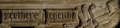
The inscriptions at Deering are also rendered in a distinct Gothic font:
Carved inscription just inside Deering's front door.

Inscription on Deering's exterior.
These two examples, with typefaces nearly identical, save for the
bottom example being elongated, show the Gothic script used for the
library. Like Gothic NU, the Deering font is also custom and unique to
the university. It is similar to medieval and Tudor gothic type styles,
which feature some capital letters rendered in minuscule style (note
the "H" in "Happy," above). This differs from Gothic NU, which has more
capital letters rendered in majuscule (note the N on the Northwestern
jersey, vs. the N on the Weber Arch, below).
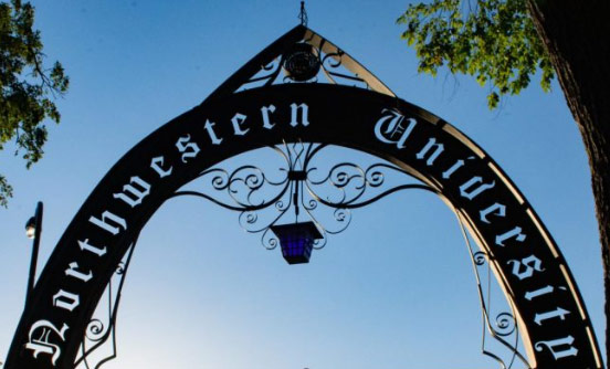
When Northwestern constructed its entry arch in 1993, which it
dedicated in 1994 as the Weber Arch, it used yet another font style,
but one much closer to the Deering font:
The lower-case t in the Deering/Arch font has a sloped top, a more
common style than Gothic NU, and the capital letters are typically
minuscule, like the N in on the arch.
With its 2026 purple Gothic uniforms, NU has combined both of its
custom fonts: it is keeping some of the uniform in Gothic NU (the
"Northwestern" wordmark on the back of the helmet, for example), while
adding some components in the Deering/Arch font (the "Northwestern" and
"University" inscriptions on the shoulder stripes).